Nav
I have been a Visual Merchant for 4+ years and I am transitioning to work in UX and Digital Product Design.
After studying UX at a bootcamp I started to recognize the similarities between these two fields.
There was a revelatory moment when I began to consider the “customer” as a “user”.
I began to observe the customer negotiate the store in the same way they would negotiate a digital product. The language in which I was describing our key performance indicators or KPIs was homogeneous with the language
I was using to present my capstone app for bootcamp.
In this article I will outline the similarities between visual merchandising and user experience
and explain how my time as a visual merchant informed my human centered design thinking.
Based on the ADA guidelines the width of an aisle is regulated to be at least 32”. Laying out the floor with these guidelines in mind isn't necessarily complicated and this creates inherent “bowling lanes” in the store. The design challenge is to create pathways and networks so that the user can access any part of the store.
To solve this problem I created a system in which each room setting has equal entry points to the room from multiple angles allowing the user to make decisions where to access not based on necessity but by choice. This, in essence, creates “user flows”.

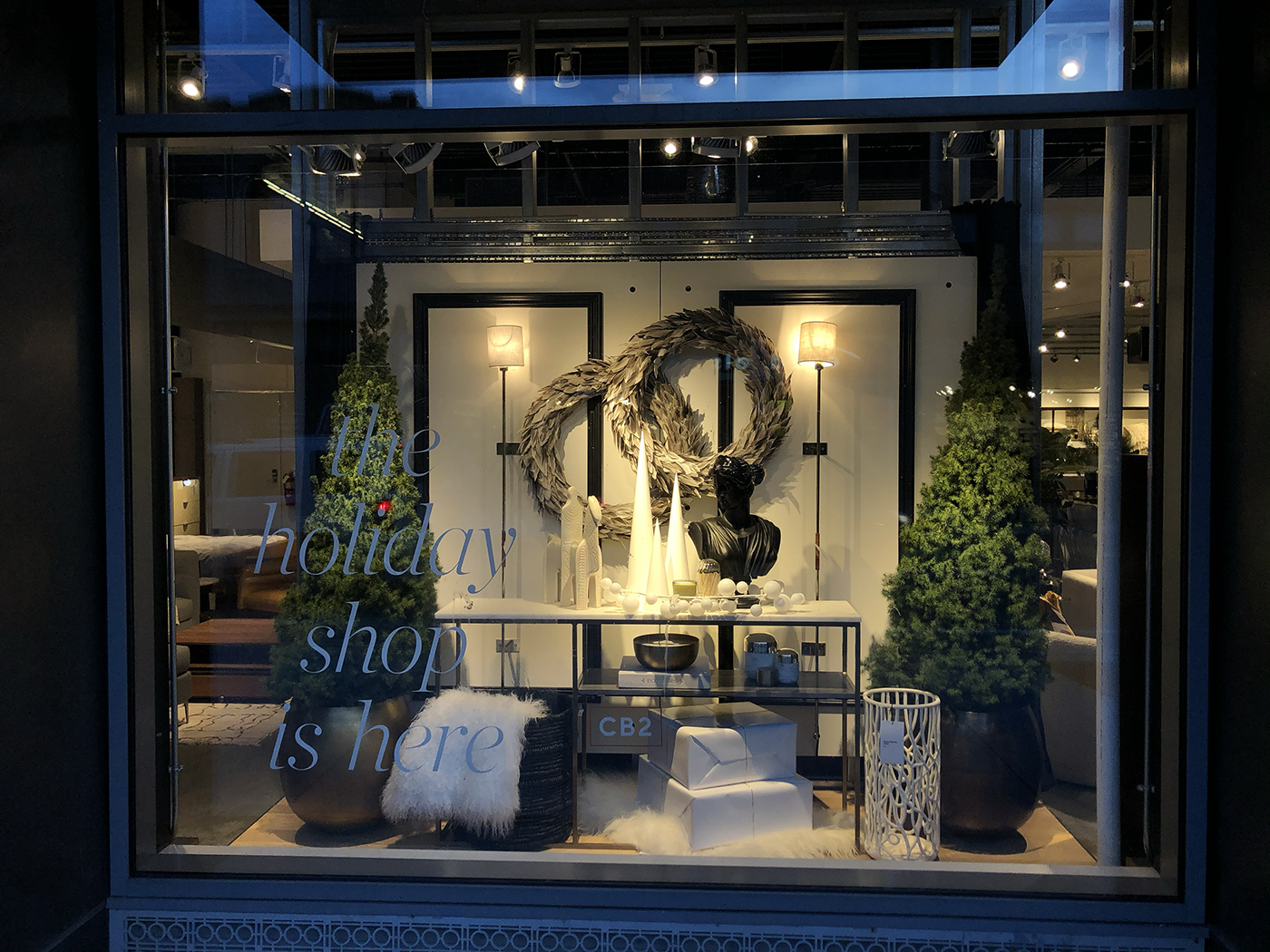
Just like a site map, the physical store has starting and stopping positions. There are two doors at my store, I consider them equally. These entrances could be understood as the Landing Page, the windows designs I create are the Splash Page.
Early in the flow of a user walking into the store I am trying to create a quick on-boarding, be it orientation or by me looking at sales data and determining what the user is looking for and placing it front row and center.
I looked at many data points and research to determine what the rate of sale is on all products in the store. I would look at something that isn't selling well and I would have to ask myself “why isn't this selling, maybe it is the way it is being displayed, or where it is in the store.” This is akin to valuable information and resources being buried within a digital product.
Maybe this information architecture is wrong. I solve these problems by tracking certain projects in the store
and moving them to locations where the user interacts more frequently. The user research is the KPI.
Key Performance Indicators help quantify the store’s sales goals. The indicator that I am most interested in UPT or units per transaction. The ideal digital product uses human-centered design thinking.
I believe this is also true when merchandising a brick and mortar. Based on our sales numbers I can gather quantitative data to show that users are interested in small add-ons. These could be adding double old fashioned glasses when purchasing a new bar cabinet.
Just like with an app the user may need/want items similar or adjacent to ones they are purchasing. The qualitative data comes from speaking with customers and figuring out their wants and needs.
Just like with personas we have to look at the quantitative data to create a clear amalgam of our users/customers. Here in Minneapolis the summers are shorter and the deck space in the cities is limited.
Initially we were selling a pretty large California style outdoor sectional. On top of the size it was also unavailable due to supply chain issues, the eta was late summer. Looking at sale numbers and our personas we were able to determine that bringing in a smaller more available sectional would sell better.
In the weeks after making this transition we increased our sales of this product by 8x.